
Veygo Design Work
I was a vital contributor to the visual and strategic implementation of an £8 million rebrand, refining my skills in brand storytelling and stakeholder management.
In addition, I led the design and development of 'Chassis', a design system. This involved creating a unified component library, establishing UX patterns, and documenting guidelines to accelerate design workflows and ensure a cohesive user experience across all digital products.


Brand Refresh
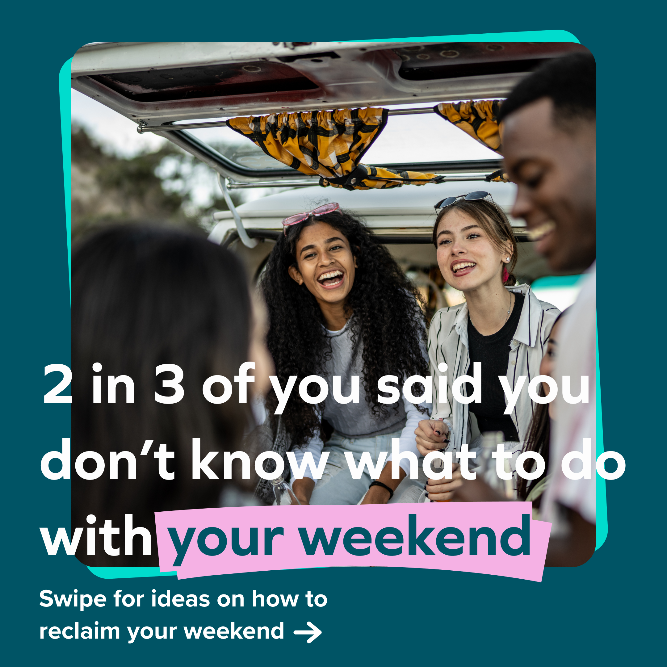
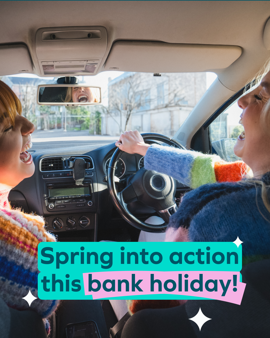
Last year, Veygo embarked on a transformative £8 million brand revolution, masterminded by Favour the Brave. As the sole in-house graphic designer, I was the crucial bridge between this high-concept strategy and its tangible execution across the entire digital ecosystem.
I thrived under a tight deadline, taking responsibility of the brand's new visual identity and transforming it into a dynamic and coherent presence. My canvas was vast: I oversaw a complete overhaul of all social media channels, email campaigns, and partnership communications, as well as the redesign of internal assets. This wasn't simply an upgrade; it was a whole brand launch, and I made sure that every touchpoint reflected the new, bold vision.

Before redesign
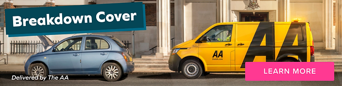
Before redesign
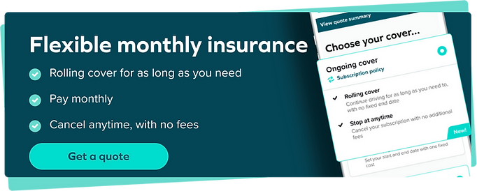
After redesign
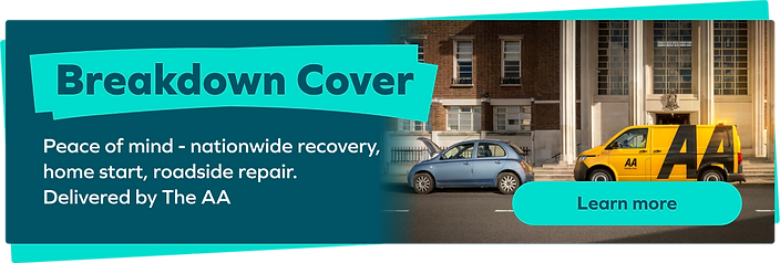
After redesign
Chassis Design System
Project Overview
With Veygo transitioning from startup to scale-up, we felt it was the right time to implement a design system. It has been in discussions for some time, but it was quite hard to prioritise with other things in our backlog. We determined that with new products in the pipeline, now is the time to develop a design system that fits within Veygo.
Initially we did an audit to determine if that was the best time for us to start work on a design system, following a rebrand and a longer design sprint in which two new products were conceptualised. We thought it was the best time to start work on a design system.
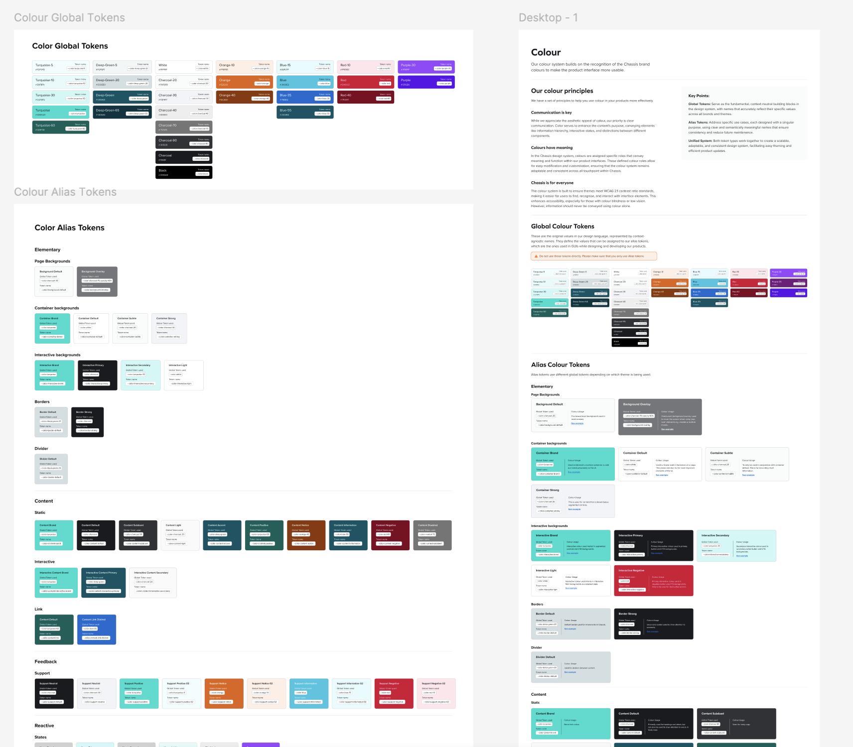
Then we moved on to creating the design system's foundation tokens. We started with the colour tokens, using the brand colours along with some additional UI-centric colours as a base to build out all the foundation colours using percentages.
We worked on spacing, padding & typography until we were satisfied with the foundation tokens. Following that, we considered what it would take to build all of the components from scratch, as well as the load it would have on the developers. We wanted to look for a lean approach, as we wanted to minimise tech debt for the devs. So we looked into different options before settling on a pre-built design system to which we could add our foundation tokens.
We landed on Shadcn after some research; it contained many of the components we required as well as some extras. We would still have to build out a few components and patterns, but it provided us with a good start. Then I moved on to creating documentation for each token.